
Did you know that colors can even affect the taste of food you are eating? In this blog post we are going to look into why color psychology in branding is important for your business. Color psychology is the science of how colors influence our actions and feelings. It’s based on the premise that certain colors trigger specific emotional responses in people. These responses are often shaped by cultural and personal associations, but there are also some universal tendencies.
In today’s competitive business landscape, where brands are constantly competing for attention, it’s crucial to understand the power of color psychology. Colors evoke emotions, influence perceptions, and can even shape consumer behavior. As an entrepreneur, understanding how colors work can be a powerful tool for building a strong brand identity and connecting with your target audience.
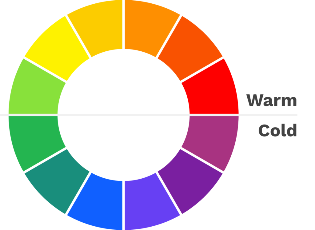
Warm Colors: Red, Orange, and Yellow
Red, orange, and yellow are considered warm colors, associated with passion, energy, and excitement. They can stimulate appetites, create a sense of urgency, and convey messages of love, joy, and warmth. Red, in particular, is often used to signal danger or excitement, while orange evokes feelings of optimism and creativity. Yellow is a cheerful and optimistic color, often associated with sunshine and happiness.
Cold Colors: Green, Blue, and Purple
Green, blue, and purple are considered cool colors, associated with calmness, relaxation, and sophistication. They can create a sense of trust, security, and peace. Green is often used to promote environmental awareness and health, while blue is associated with tranquility, honesty, and intelligence. Purple is a combination of red and blue, representing both passion and wisdom, making it a versatile color choice for brands that want to project both strength and elegance.
Using Color Psychology for Brand Messaging
As an entrepreneur, understanding the emotional impact of colors is essential for crafting a brand identity that resonates with your target audience. By carefully selecting colors that align with your brand’s values and messaging, you can shape how people perceive your business.
Here are some tips for using it in your branding:
- Consider your target audience: Who are you trying to reach? What are their age, gender, and cultural background? Understand their preferences and associations with different colors.
- Define your brand personality: What kind of emotions do you want your brand to evoke? Are you seeking to project luxury, affordability, or trustworthiness? Choose colors that align with your brand’s personality.
- Use color consistently: Maintain a consistent color palette across all your brand touchpoints, including your website, logo, marketing materials, and physical space. Consistency helps reinforce brand recognition.
- Use color contrasts: Contrasting colors can create visual interest and draw attention. However, avoid using too many clashing colors, as this can create visual chaos.
- Consider color psychology in context: The meaning of colors can vary depending on the context. For instance, red might symbolize danger in a stop sign, but it could represent love in the context of romantic relationships.
Color psychology is a valuable tool for every entrepreneurs, businesses and organisations of all sizes. By understanding the emotional impact of colors, you can create a brand identity that connects with your target audience and helps you achieve your business goals. When used strategically, color can be a powerful influencer, shaping how people perceive your brand, make decisions, and form lasting impressions. And, as you might know, there is a whole lot more to brand identity, for example design thinking plays a very important role, too.
Are your entity in need of a new design? Let’s get in touch! We can help you create a cohesive visual representation that aligns with your brand and resonates with your target audience.
Q: How can I use color psychology to make my brand stand out from the competition?
Use unconventional color combinations or unexpected applications of color. For example, you might use a bright shade of pink for a traditionally masculine brand to create a sense of intrigue and uniqueness.
Q: How can I use color psychology to create a sense of urgency?
Use warm colors like red, orange, and yellow, which are associated with excitement and stimulation. For example, you might use red on your website’s CTA button to encourage visitors to take the next step but of course there are other factors to consider, such as cultural and demographic aspects, the surroundings of the button (contrast) and the overall color scheme of your page.
Cover photo: Andrej Lišakov